

Your guide to colors – for different ways of seeing.
Colors don’t look the same to everyone. What seems obvious to some may appear identical, muted, or harder to distinguish for others. This can affect everyday choices like clothing, recognizing objects, reading text, or navigating digital interfaces. For designers and developers, it can also mean unintentionally creating experiences that are difficult to use.
Clearly different?
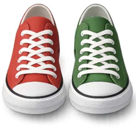
Not for everyone.
HueGuide helps bridge that gap.
Designed with accessibility and inclusion in mind, HueGuide makes it easier to understand colors, compare them, and create experiences that work for more people.
What HueGuide helps you do
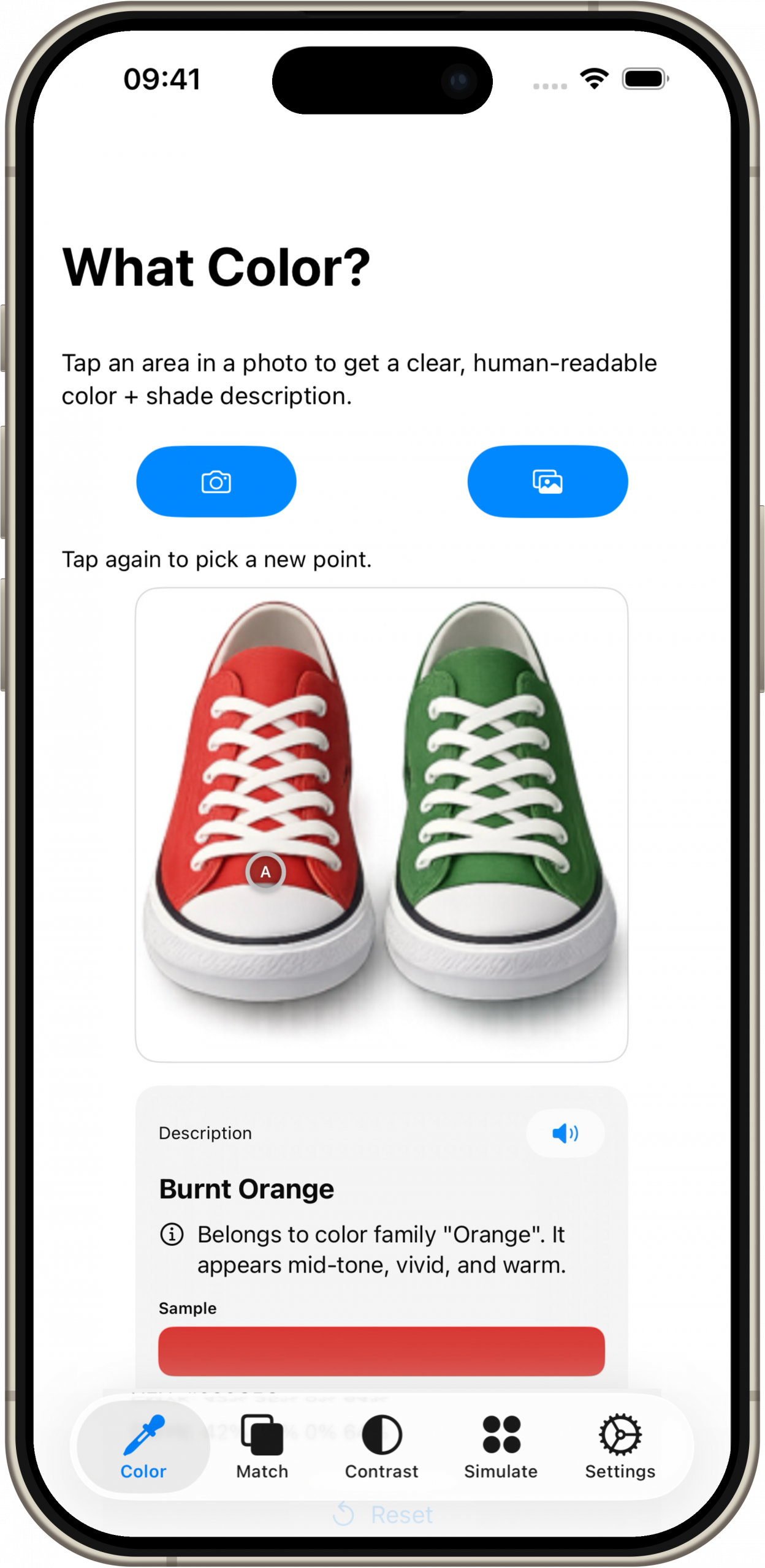
Identify Colors
Not sure what color it is? Tap to find out. HueGuide helps identify colors from photos and images with clear, easy-to-understand results.
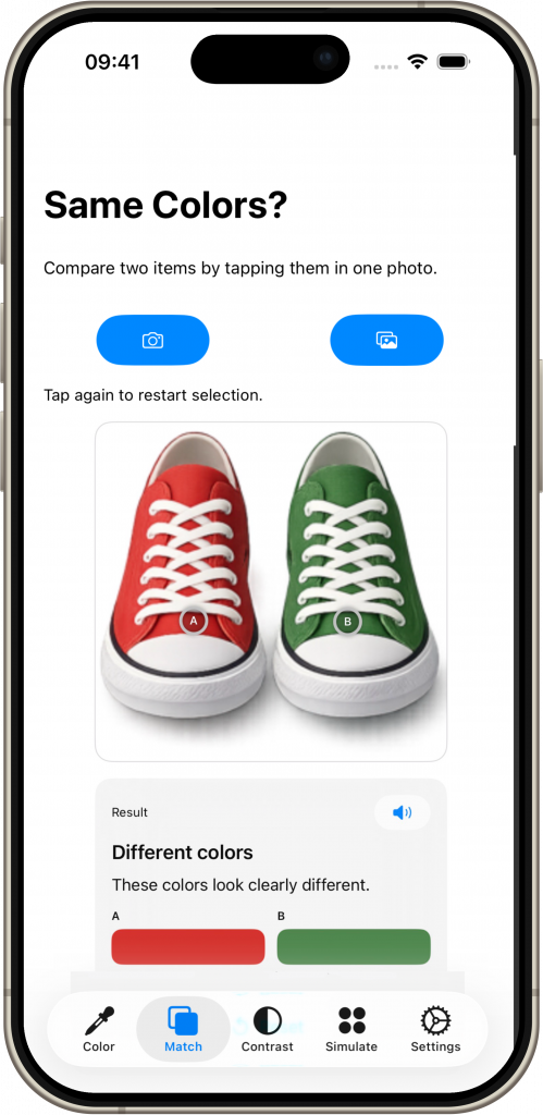
Compare Colors
Looks the same? Check to be sure. Compare colors side by side to see whether they are truly different or only appear similar.
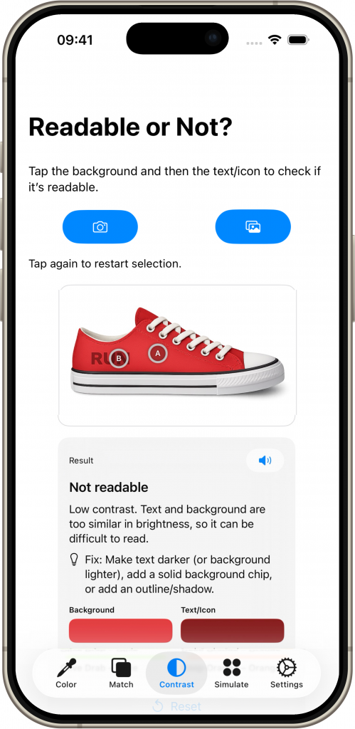
Improve Readability
Hard to read? Design for everyone. Test text and background combinations to better understand contrast and readability.
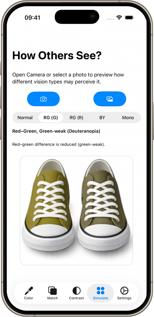
Explore Different Perception
See through different eyes. Understand how colors may appear to people with different types of color vision.
Built for Everyone
For people with color vision differences
Gain confidence in everyday situations involving colors.
For designers and developers
Create more accessible, inclusive products and interfaces.
For families, friends, and curious minds
Better understand how others may experience the world.
Why HueGuide Matters
Inclusive design starts with awareness. HueGuide helps make invisible challenges more visible — and supports better choices for everyone.
Download HueGuide
Available on the App Store for iPhone and iPad.