

In this code-along, we’ll build a smooth morphing animation between SF Symbols which was originally created by Kavsoft and where you can also follow along. We want to provide some more background to the used techniques.
This morphing creates a super nice effect when the user taps an icon, the current symbol blurs, melts into a soft “gooey” shape, and reappears as the next symbol:
We’ll use three SwiftUI ingredients:
- A reusable MorphingView
- An animatable modifier
- A small grid of SF Symbol buttons
The final result feels playful, modern, and surprisingly simple once we break it down.
Step 0: Set up your project
- Open Xcode: Launch Xcode and select Create a new Xcode project.
- Choose Template: Select App under the iOS tab and click Next.
- Name Your Project: Enter a name for your project, like
MorphAnimation.- interface: SwiftUI
- language: Swift
Click Next, and then save your project.
When you open your project, you’ll see the already familiar standard code presenting a globe and the Text “Hello, world!” in the ContentView.swift.
To keep ContentView clean and the project easier to understand, we present here our custom `SystemImageView
import SwiftUI

struct ContentView: View {
    var body: some View {
        SystemImageView()
    }
}
Step 1: Create the Symbol Selection View
Create a new SwiftUI file called SystemImageView.swift.
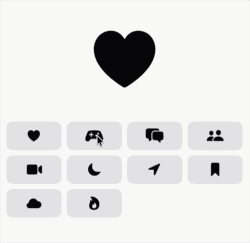
We start with a list of SF Symbols and a few pieces of state.
import SwiftUI

struct SystemImageView: View {
    @State private var toggle: Bool = false

    private var symbols: [String] {
        [
            "suit.heart.fill",
            "gamecontroller.fill",
            "bubble.left.and.bubble.right.fill",
            "person.2.fill",
            "video.fill",
            "moon.fill",
            "location.fill",
            "bookmark.fill",
            "cloud.fill",
            "flame.fill"
        ]
    }

    @State private var currentSymbolImage: String = "suit.heart.fill"
    @State private var nextSymbolImage: String = "suit.heart.fill"

    var body: some View {
        VStack {

        }
    }
}
Why do we need two image names?
currentSymbolImage
nextSymbolImage
The morphing effect switches between these two symbols. The toggle value decides which one is currently visible. By default we set both images to 🖤.
Step 2: Add the Morphing Symbol Area
Inside the VStack, add the main animated symbol.
MorphingView(blurRadius: 40, toggle: toggle) {
    Image(systemName: currentSymbolImage)
        .font(.system(size: 100))
} to: {
    Image(systemName: nextSymbolImage)
        .font(.system(size: 100))
}
.frame(height: 150)
.frame(maxWidth: .infinity)
MorphingView receives two views:
from
to
In our case, both are SF Symbols. Later, our reusable MorphingView will decide which one to show and how to animate between them. Create a new SwiftUI file called MorphingView so that we do not get an error. Leave the view as it is. We will work on that in a minute.
Step 3: Add a Grid of Symbol Buttons
Below the morphing symbol, add a grid of buttons.
LazyVGrid(columns: Array(repeating: GridItem(), count: 4)) {
    ForEach(symbols, id: \.self) { symbol in
        Button {
            withAnimation(.interpolatingSpring(duration: 1.0, bounce: 0, initialVelocity: 0)) {
                if !toggle {
                    nextSymbolImage = symbol
                } else {
                    currentSymbolImage = symbol
                }

                toggle.toggle()
            }
        } label: {
            Image(systemName: symbol)
                .font(.title3)
                .frame(height: 45)
                .foregroundColor(.primary)
                .frame(maxWidth: .infinity)
                .background(.fill, in: .rect(cornerRadius: 10))
                .contentShape(.rect)
        }
    }
}
.padding(15)
Here, every button updates either the current or next image, depending on the current state of toggle.
This part is important:
if !toggle {
    nextSymbolImage = symbol
} else {
    currentSymbolImage = symbol
}
Because our morphing view alternates between two slots, we update the hidden slot first, then toggle the animation.
The animation is triggered here:
toggle.toggle()
And because it happens inside withAnimation, SwiftUI animates the change.
Step 4: Create the Reusable MorphingView
Open MorphingView. MorphingView will be generic`- a generic is a placeholder for a type that is not known when you write the code. We want to create a view that works with two arbitrary SwiftUI views i.e.:
struct MorphingView<From: View, To: View>: View
That means it does not only work with SF Symbols. It can morph between any two SwiftUI views. It could morph between images or text or a combination of it. Note, that images should have a transparent background to make this effect visually appealing.
Let us update our MorphingView to this:
import SwiftUI

struct MorphingView<From: View, To: View>: View {

    var blurRadius: CGFloat
    var toggle: Bool

    @ViewBuilder var from: From
    @ViewBuilder var to: To

    var body: some View {
        ZStack {
            if !toggle {
                from
                    .contentTransition(.identity)
                    .transition(.opacity)
            } else {
                to
                    .contentTransition(.identity)
                    .transition(.opacity)
            }
        }
        .modifier(MorphingModifier(
            progress: toggle ? 1 : 0,
            blurRadius: blurRadius
        ))
    }
}
The ZStack shows either the from view or the to view:
if !toggle {
    from
} else {
    to
}
The actual magic happens in the modifier:
.modifier(MorphingModifier(...))
which we will consider in the next step.
Step 5: Add the Animatable Modifier
Below MorphingView, add this modifier:
@Animatable
fileprivate struct MorphingModifier: ViewModifier {
    var progress: CGFloat
    @AnimatableIgnored var blurRadius: CGFloat

    func body(content: Content) -> some View {
        content
            .compositingGroup()
            .blur(radius: blurRadius * blurProgress)
            .visualEffect { content, proxy in
                content
                    .layerEffect(

                    )
            }
    }

    private var blurProgress: CGFloat {
        return progress > 0.5 ? abs(1.0 - progress) : progress
    }
}
This modifier is really the heart of the entire effect. Without it, you would simply switch from one symbol to another. The modifier is what creates the illusion that one symbol melts into the next.
The key value is: progress:
- When
toggleisfalse,progressis0. - When
toggleistrue,progressis1.
And with the type attribute @Animatable, SwiftUI animates between these values for ‘progress’. (Otherwise it would immediately jump from ‘0’ to ‘1’.)
Step 6: Understand the Blur Progress
The blur should increase during the first half of the animation and decrease during the second half.
That is what this computed property does:
private var blurProgress: CGFloat {
    return progress > 0.5 ? abs(1.0 - progress) : progress
}
At the beginning:
progress = 0
blurProgress = 0
In the middle:
progress = 0.5
blurProgress = 0.5
At the end:
progress = 1
blurProgress = 0
So the symbol starts sharp, becomes blurry, and then becomes sharp again.
That creates the soft morphing feeling.
Step 7: Create the Alpha Threshold Shader
Create a new file called AlphaThreshold.metal. Please create it by selecting the Metal File template when creating the file.
What is a shader? It’s a small program that runs directly on the GPU.
Instead of modifying an entire image at once, a shader looks at one pixel at a time and decides:
“What color should this pixel have?”
Think of it like a very fast filter.
Original Image → Shader → Modified Image
SwiftUI allows us to use Metal shaders through APIs such as:
.layerEffect()
.colorEffect()
.distortionEffect()
In this project we are using .layerEffect().
Please add this code to AlphaThreshold.metal:
#include <metal_stdlib>
#include <SwiftUI/SwiftUI_Metal.h>
using namespace metal;

[[stitchable]] half4 alphaThreshold(
    float2 position,
    SwiftUI::Layer layer
) {
    float thresholdValue = 0.5;

    half4 color = layer.sample(position);

    return color.a >= thresholdValue
        ? half4(color.rgb / color.a, 1.0)
        : half4(0.0);
}
What Does [[stitchable]]` mean?
This attribute tells SwiftUI: “Make this Metal function available to SwiftUI.”
Without it, SwiftUI cannot find the shader.
Because the function is stitchable, SwiftUI automatically creates:
ShaderLibrary.alphaThreshold()
Let’s take a closer look to the function signature:
half4 alphaThreshold(
    float2 position,
    SwiftUI::Layer layer
)
position represents the current pixel coordinate being processed e.g. (0,0). The shader is executed for every pixel of the layer.
layer represents the view being modified. In our case this is the blurred SF Symbol. The shader can inspect any pixel by calling:
layer.sample(position)
This retrieves the color of the current pixel. A color contains four values:
R = Red
G = Green
B = Blue
A = Alpha
For example (1.0, 0.0, 0.0, 1.0) means: Red, fully opaque, while (1.0, 0.0, 0.0, 0.2) means: Red, mostly transparent.
The alpha value is particularly important for this shader. It controls the transparency. alpha = 1 means: fully visible while alpha = 0 means: fully transparent / completely invisible. Blurred edges have alpha values somewhere in between. This is what makes them look soft.
The threshold value:
float thresholdValue = 0.5;
becomes our decision point:
Alpha ≥ 0.5: keep the pixel, Alpha < 0.5: remove the pixel which we have implemented here:
return color.a >= thresholdValue
    ? half4(color.rgb / color.a, 1.0)
    : half4(0.0);
creates a new color where:
color.rgb / color.arestores the original red, green, and blue color intensity.1.0sets the alpha (opacity) to fully opaque.
In simple terms:
“Keep the pixel’s color, but make it fully solid instead of partially transparent.”
Please note that dividing by color.a is necessary because the color values in a SwiftUI layer are often premultiplied by alpha i.e. a half-transparent red is stored as (0.5,0,0,0.5) instead of (1,0,0,0.5) – so dividing by color.a restores the full color.
And if the Alpha is too small, then the pixel disappears completely.
Step 8: Add the Gooey Effect
The blur alone already looks nice, but the special “morphing” feeling comes from the Shader we can now add in MorphingModifier:
.visualEffect { content, proxy in
    content
        .layerEffect(
            ShaderLibrary.alphaThreshold(),
            maxSampleOffset: proxy.size
        )
}
The shader applies an alpha threshold effect. In simple words: it strengthens the visible shape after blurring.
Blur spreads pixels outward. The alpha threshold pulls the blurred shape back into a more solid form.
Together, these two effects create the “gooey” morph:
blur + alpha threshold = morphing effect
Step 9: Run the App
Now run the app and tap different symbols.
Each tap should:
- Store the newly selected symbol
- Toggle between the two symbol slots
- Animate the blur
- Apply the alpha threshold shader
- Reveal the new symbol
You now have a reusable morphing transition for SF Symbols.
What you have learned
This effect is a lovely example of how small SwiftUI building blocks can create something that feels very polished.
We used:
@Stateto track the current and next symbolwithAnimationto animate changes- a reusable generic
MorphingView - an animatable modifier
- blur and shader effects to create the morphing look
The best part: once the MorphingView is created, you can reuse it in other places — not only for SF Symbols, but also for text, shapes, or custom views.
That’s a wrap!
Keep learning, keep building, and let your curiosity guide you.
Happy coding! ✨
Change may not always bring growth, but there is no growth without change. – Roy T. Bennett
Download the full project on GitHub: https://github.com/swiftandcurious/MorphAnimation